Optimizing Liantis FAQ for maximum content accessibility
As a social insurance fund, Liantis acts as the link between self-employed individuals and the government. Liantis handles your affiliation, calculates your social contributions, and assists you in optimizing your social security.
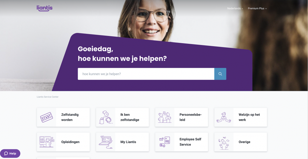
Liantis encountered challenges related to their previous FAQ page, which was not fully aligned with their website’s overall user experience. The structure of the previous layout presented a significant hurdle in delivering maximum content accessibility to users.
This misalignment between the FAQ page and the website as a whole hindered Liantis’ ability to provide comprehensive information in a user-friendly manner. Users often faced difficulties in accessing the specific content they needed, resulting in a less-than-ideal online experience.

The solution: Enhancing user experience at Liantis
In addressing the misalignment between the previous FAQ page and Liantis’ website, Premium Plus employed a tailored approach. The Liantis team developed a bespoke design that harmonized the FAQ page with the overall website structure. Our toolbox included HTML, CSS, and JavaScript (js) to create a seamless integration.
The result is a FAQ page that not only aesthetically aligns with Liantis’ website but also offers an enhanced performance. The Liantis team is highly satisfied with the revamped look and improved user experience.
What truly stands out in this project are its user-centric features. All articles are now elegantly presented on the category page after the first user click, streamlining access to vital information. Users can effortlessly switch between sections to explore all articles within a category without the need for page reloads. Plus, accessibility to other categories is consistently maintained throughout the inner pages, ensuring a cohesive and user-friendly browsing experience across the entire website.

Inspired by this project?


